Color management systems have been either the bane of existence for creatives or their savior. The opinion seems to depend on the day, month, and hour. The intersection of digital photography, powerful graphics processing units, and expanded gamut displays, printers, cameras, and devices place those expectations into an increasingly complicated focus.
Let me explain. In my academic career as a professor, department chair, coordinator, and lab designer, I taught digital photo and imaging classes in higher education for over 30 years. Starting with early versions of Adobe Photoshop, the gap between what students saw on screen and what ended up in their printers was often a disappointment, an expensive lesson in understanding color on computers. Color management systems (CMS) to the rescue, or so we hoped. But one of the issues with most CMS is that they are designed from beginning to end for the single user. Academic environments are very different in that regard. Vendors pushed CMS to save money on wasted ink and materials, all of which was valid, and I often used their presentations to teach the importance of CMS. Thank you, X-Rite, GretagMacbeth, and Datacolor for those materials over the years.
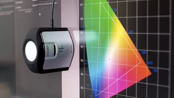
Consider monitor calibration. Until recently, calibration and profiling required an external device, commonly known as a puck, and the process, especially with displays designed expressly for critical color work, was seamless. Attach the puck to the screen, fire up the software such as NEC’s SpectraVision, and choose your goal: either measurement, profiling, or just checking on the status. Often, you will calibrate to a known profile, and in a lab setting, a common profile that all the displays use. It’s a good system, allowing students and faculty to have an accurate color space with which to work. I had the most experience with NEC products and their approach to color calibration and profiling, and served as a member of the Visionaries of Color group, but I was intimately involved with first GretagMacbeth and X-Rite, and after they merged, the best of both worlds, along with the popular Spyder system from Datacolor.
It’s worth noting that with the various mergers in the color management world, users were often forced to not only choose their tool of choice, but wisely, most of the merged firms kept the workflow somewhat similar, so they didn’t require too much retraining. This is especially important since higher ed requires faculty, departments, and chairs to create added resources, syllabi, and files whenever there is a significant change in workflow, software, licensing, and hardware. This wasn’t unique to academia—visits to photo conferences often found overflowing crowds or standing room only for sessions related to color management. So, it seemed like everyone was confused and seeking answers.
Many of the issues at institutions arise with the concerns of the IT department, which prefers to lock down systems so they can’t be hacked or corrupted. Since most software is designed to write to specific system folders, especially in the case of generated profiles, this becomes a challenge. At University of the Arts (UArts), our systems utilized a refresh approach, which meant that every time a student logged in, it was essentially a fresh, sparkling new system. This also meant that any profiles or calibration data they created were instantly lost. This led to the creation of a workspace partition where profiles could be saved to and then manually dragged over to the OS profile areas, and for that working time, the system could see and use custom profiles.
This came into play on a perpetual basis, as students would purchase a variety of digital papers, often on a last-minute basis (thank goodness for next-day delivery), so despite publishing a list of supported media and stocking media in the student store, students would inevitably show up with a paper, banner material, film, or canvas not on that list. Then, when their prints didn’t match the screen, the combination of assignment deadlines, procrastination, malfunctioning gear, and computer OS gremlins all conspired to make folks seriously cranky and unhappy. And blaming everyone in sight.
At the start of the transition from analog chemical-based photographic processes to digital imaging, the school owned all the computers and cameras, so in one sense, that reduced the variables, but when the laptop revolution occurred, students would work on their own systems, often ignoring class requirements to calibrate their own computers, even though industry partners had donated calibration pucks and software, all of which was available from the equipment room, free to check out. High-quality mobile phone photography presents an entirely different challenge. Despite the predictions that digital would mean the end of prints, the exact opposite happened—prints, large prints, it turned out, became the final disposition of creative endeavor. This wasn’t a surprise, with galleries showing work where a 40×60-inch print wasn’t considered exceptional.
While the hardware and software all made huge strides in usability, almost all of it was designed for single-user situations. Educators and IT departments all figured out work-arounds, but it highlighted how the promise of color management doesn’t always achieve the goals it sets for itself. Color management does work for most consumers when they stick to the printer manufacturers’ own papers and media, but the creative market thrives on third-party materials and solutions, even if they require custom profiles and media settings. Fortunately, those vendors quickly responded by creating free custom profiles for paper and printers that students, educators, and users could easily download. But if you remember when it started, several folks made their business model to supply custom profiles for industry-standard papers, charging for the profiles that the paper and printer manufacturers had yet to produce.
To this day, many printer companies only supply profiles for their own branded paper, which makes sense from a support point of view but ignores the way that most people work. A few companies were visionary in this sense. HP started to feature profiles for Hahnemuhle papers on their website when they because aware of how many of their customers were using their papers, as evidenced by the popularity of Hahnemuhle Photo Rag, pioneered by Wayne Connelly and his team at the company. The paper community is a small one, with Connelly leaving to found Innova Art, Ltd. with other members from Hahnemuhe. A quick look around the folks in the paper industry reveals how well all the players know one another. In many ways, this benefits the educational and creative environment, since these are folks with long histories and experience, so customers now benefit with higher-quality prints on a variety of substrates with a faster path to acceptable results.
At the start of each semester, we would try to ascertain what papers and materials our students would probably consider purchasing, along with our base of printers, and compile a folder of profiles for the IT department, which would include them in the next refresh of the master system image. However, our relationship with IT was a continual struggle between our need as faculty to keep the labs current with the latest versions of Adobe software, and new profiles, and the underfunded and understaffed IT department’s need to keep things working on an academic-year basis, while being responsive and having to work the midnight hour to keep things working. And face it, keeping folks running Excel happy is a lot simpler than a group of photo students or film majors. Add to this the pressure that most academic institutions face. Students are paying a lot of money to attend school and are going into debt doing so, and it’s a compressed, intense time. Most semesters are only 15 weeks, and once you toss out the first and last class meetings, and celebrate a holiday or two, there isn’t that much time for actual teaching, so the labs and facilities must work. And, color printing issues become even more apparent under pressure.
As an example, in 2009, we purchased a pair of HP Z3100 printers, which had a revolutionary feature—a built-in paper profiling system. It was a brilliant design; our students could load any material into it and, without muss or fuss, create custom profiles. I remember that one of our students wanted to print her thesis exhibition on the brown paper bags you get at the market. As it was uncoated media, we had no usable profiles. So, she loaded it up in the HP and soon had a test pattern printed. We profiled the pattern, saved the results, and in the morning, we profiled it again to test for any dry down drift. There was enough of a change that we went with the aged test pattern, and she was able to print a unique creative statement—all without using any third-party calibration or profiling tools. Having it built into the printer made this extremely easy. A compelling solution.
The problem with the system is that HP had a single user with a relatively small number of profiles in mind when it created its system, and many of our students wanted to create their own profiles for paper they bought. So, we soon exceeded the quantity allotted by HP in its software, since the system had been created with a single user in mind, not 40 senior photo majors like we had. Even though at that time we had full control of the Mac Pro workstation (cheese grater model) that was connected to the printer, there were limits imposed on the CMS by both Apple and HP. Even though Mac OS X was designed as a multiuser operating system from the start, the tools we use in graphics are often single user in intent and operation. Mind you, we designed those labs with the most powerful GPU cards that Apple offered in a Build-to-Order configuration, along with dual NEC SpectraVision displays and dedicated scanners, so this was a lab designed to eliminate any excuses arising from a lack of gear.
Accordingly, color management, profiling, and calibration were primary goals from the very first day when we started to design the lab. The fly in the ointment is that as powerful as GPUs are now and the sophistication of software, creative applications, and display and printer technology, with their increased color gamut and more, our challenge is much the same as it was in the early days of color displays. And that is to make it as easy as possible for users to achieve their creative goals, and part of that mission depends on easy adoption of multiuser-designed color management tools, and the industry’s acknowledgment that the single-user model needs reconsideration.